by Cheryl | Sunday, August 23, 2020
With so many people interacting virtually these days, I wanted to share these 3 crucial tips to keep your audience engaged. I promise it doesn’t take much and these 3 things are super EASY to implement!

Over the years, digital marketers have figured out what works to keep their audiences engaged. If you’re just entering the digital world, you’ll want to pay close attention.
It’s actually fairly simple and as an added BONUS I found one more tip (and it’s a biggie) to share with you, you’ll find that at the end!
1. Your Audience Needs to SEE You
Yes, it’s that simple! It’s hard to make an impact if your audience can’t see you. Tip NUMBER ONE is to make sure you have good lighting. There’s nothing worse than watching a Facebook live, Instagram story, Zoom or Webex and not being able to see. To avoid this, make sure any direct light is in front of you. It’s a good idea to play with the lighting by turning specific lights on and off to see what works best for your video.

Ring lights can make a HUGE difference if you’re filming from your home, office or classroom. There are various settings to make sure you have just the right light and your audience can see you clearly. Here’s the one I’ve used and have come to love but there are plenty of others out there as well:
Selfie Ring Light – don’t be fooled by the name, this one works great even if you’re virtually engaging your audience from a desktop or laptop computer!
2. Your Audience Needs to HEAR You
Just as simple, your audience needs to HEAR you! I can’t tell you how many times I’ve watched a video or listened to a podcast and the sound was too soft, too loud or just plain distracting. It’s important to test your voice with whatever device you’re using.

Sound tends to carry depending on your room so you’ll want to make sure your sound isn’t bouncing off the walls or worse too quiet. Feedback is also hard to “listen” around. You may have great sound by attaching headphones to your device, but you’ll have to try it out to be sure.
Adding a microphone to make sure everyone can hear you loud and clear is also a great way to give your audience the best experience! A microphone can help project sound, this way your audience isn’t wondering what you’re saying. Here are a few microphones at various price ranges that might be helpful (blue tooth microphones can be expensive!):
- PoP voice Professional Lavalier Lapel Microphone (16.99)
- Blue Snowball (49.99)
- FIFINE Mini Gooseneck (25.99)
3. Your Audience Needs VARIETY
Here’s the kicker and this one may be the most difficult to implement. If you’re recording or doing live video, no one wants to be talked “at”. BUT if you’re recording or doing live video, that’s exactly what you feel like your doing at times! People need variety, they need to watch you doing something.

How can you avoid being a “talking head”? Props, camera angles and slides are the way to go. If you’re using strictly audio, you won’t have to worry about this (but you’ll really need to stay on task during that audio session). If you’re teaching, selling or showing someone how to do something you need to implement these 3 things.
- Talk but change camera angles.
- Use props, slides or items to vary your message.
- Show your audience what you’re doing while talking them through the lesson.
If you’re instructing, you’re going to have to mix it up. You can show your audience your screen by switching your camera to your computer, then you can talk through your slides. Any change of screen will help keep your audience engaged. Simple slides will help guide your audience through your lesson. CANVA is a great resource to create any kind of graphics. Canva has SO many templates all you’ll have to do is add your information.

If you’re showing someone how to make something or you’re selling a product, you’ll want the audience to feel like they’re in the room with you. Point the camera down at the recipe or craft or painting so your audience can SEE what you’re doing. If you’re selling a product, you’ll want to describe the product and show your audience what it looks like, how it feels and why they need to purchase it.
BONUS TIP: The Brain Needs to Hear (read, see) Information 8 TIMES to Processes It!
Make sure your audience can see, hear and follow you.
Make sure your audience can see, hear and follow you.
Make sure your audience can see, hear and follow you.
Make sure your audience can see, hear and follow you.
Make sure your audience can see, hear and follow you.
Make sure your audience can see, hear and follow you.
Make sure your audience can see, hear and follow you.
Make sure your audience can see, hear and follow you.

See what I did there? I hope you’re still with me!
If you’re an educator, this means your students need ALL the important information right in the beginning and you’ll need to repeat that information eight times! I know, it sounds like a lot but it really REALLY works, promise! If you’re a business owner, same thing, make sure your most important content is on your site, landing page, sales page EIGHT TIMES.
This tip works for small business owners when marketing, selling or communicating information. Try it and see.
MORE MARKETING TIPS:
by Cheryl | Saturday, August 15, 2020
Email Marketing … is it dead? This is the question small business owners have been asking over and over again. I’m going to let you in on a (BIG) little secret … NO … email marketing is not dead and it’s the single most effective way to engage with your audience!
Let’s Get Started
If you’re just getting started or already have a list but you want to build that list to generate more sales, views or just keep your audience coming back, email marketing is just for you. 
1. CHOOSE YOUR EMAIL PROVIDER
The very first thing you need to do if you’re getting started with email marketing is to choose an email provider. There are plenty of free options out there (especially while you’re building your list). Here are the top 3 free email providers:
-
- ConvertKit
- MailerLite
- MailChimp
I use ConvertKit and love the simplicity of its features and offerings. Depending on what your small business does (i.e., sell, blog, instruct) you’ll want to take a look at what these email providers offer as your business continues to grow. For instance, if your business mostly sells products, make sure the provider you choose has options for automation. Automations help you stay connected to your customers by “automatically” sending out emails at some time in the future. Let’s say you have a customer who recently made a purchase from your site. You can set up an automation for a recent purchase asking your customer if they were happy with the product they received, inquire about the check out process and basically gain some really valuable information for your business.
2. SET UP YOUR WELCOME EMAIL
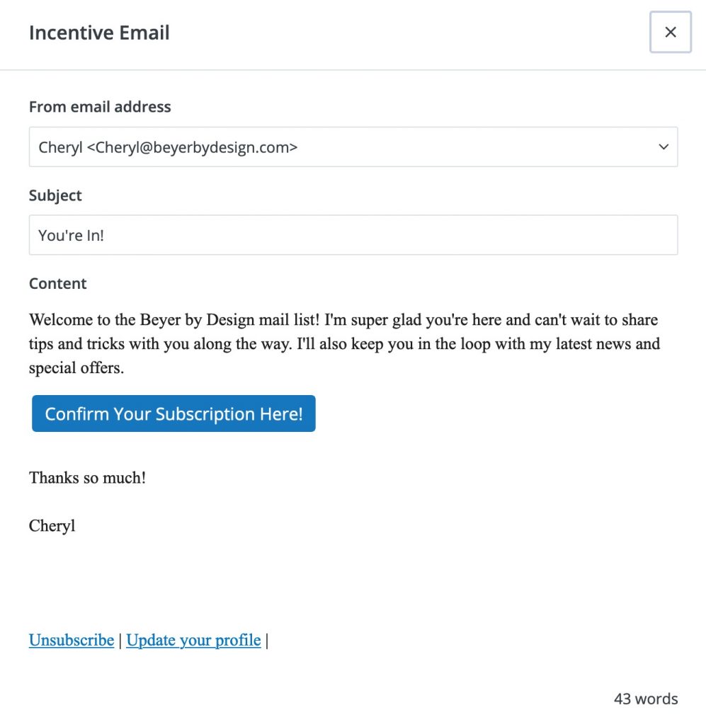
The very first thing you’ll need to do is set up your welcome email. This email is your first chance to connect with your audience/customer. You’ll want to thank them for trusting you with their email, let them know how often they’ll hear from you and what to expect from you in the future. It’s important to nurture your audience and make them feel welcome while adding value to their lives. 
3. CREATE A FORM FOR YOU WEB SITE
Once you have your welcome email all set up, you’ll need a place to gather those emails. Forms are what you’ll place on your website to capture those emails. Most email providers have templates you can use to make this task easy. Once you’ve selected a form and have it connected to your welcome email, you’ll need to place it on your site.

Now that you have your form ready to go, you’ll want to grab the code and EMBED that code on any pages where you’d like to gather email addresses.
TIP: Be sure to link your SUBSCRIBE button on your Facebook page as another way to gather more emails
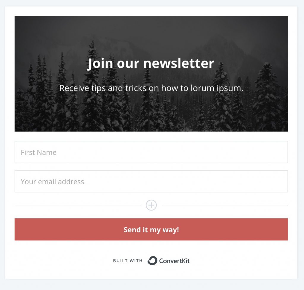
You can see a copy of my email form here. I wanted to keep mine simple (and I’d love for you to sign up for my email list as well)!

After your reader has signed up for your email list, it’s nice to send them to a Thank You page. This can be one page where you thank your audience for trusting you with their email as well as a place to share valuable information with them. Here are a few things to include on your thank you page:
-
- Make sure you have a line on there for your reader to check their spam folder for your email.
- Alert your reader to the email address that your emails will be coming from.
- This is a good place to let your reader know what else you offer on your site! Highlight your value to them here!
- Make sure you have a link to contact you if they didn’t get your email.
Email marketing is the single most effective way to connect with your audience/customers! Make sure your site is all set up from the beginning to grab those emails and start nurturing your audience today!
by Cheryl | Saturday, July 18, 2020
I’ve been a designer for so many years, I don’t ever remember NOT being a designer. That being said, several years ago when a local company asked if I did package design, I immediately said a resounding, “YES!”
I mean, how hard could it be?

Well, I learned quickly that there are many things to think about when considering package design. While the process may be somewhat the same I’ve found these 4 tips to be helpful when designing packaging.
Here are the top 4 things to consider when undertaking a package design project:
1. Who is Buying the Product You’re Designing
The very first thing you need to be clear on is WHO is buying your product. For instance, packaging for a predominately female group of buyers will yield different designs than packaging for a predominately teen group of buyers. Once you have a clear idea of WHO your buyer is, the ideas will start to flow.
2. Research “Like” Products
Research, research, research! It’s the name of the game for any designer.
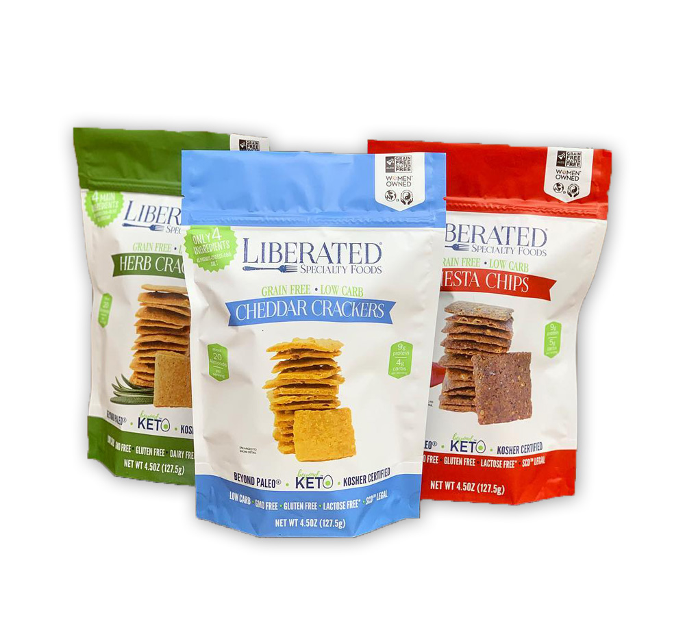
Find products that sell WELL. Those that are household names (they became household names for a reason). If you’re designing for a food product, go to the grocery store. See how things are displayed and what makes one product stand out over the other ones. If it’s make-up you’re designing for, head over to Sephora and see which products stand out. I also love to search on Amazon to see what’s the best selling product for cookies, mascara and chips. Be sure to concentrate on what the product looks like, what catchphrases stand out and what colors they use.

3. Color
Colors really do make or break you here. You know this as a designer and you know this as a customer. If you’re designing a product that is one of many, you’ll want to coordinate those colors. They need to look cohesive when all the products are together.
Hopefully, your research (from number 2) has given you a great place to start. I also love to use Adobe Color to see what the trends are for the moment. It’s a great resource to find the main, complementary and pop colors for your package design. Some other great resources for color are Design Seeds

4. What Makes You Different?
Now, what makes your product different from ALL the rest of the products out there? This is so integral when designing ANYthing, but especially with package design!
What is the ONE thing this product promises to do (that’s appealing to your buyer)?
What problem are you solving for your buyer?
How will your product make your buyer’s life better and easier?
Maybe your designing for a specific community, say mascara that’s hypoallergenic. This main concept needs to be displayed first and foremost for your buyer to easily see. You can do that many different ways, but once you know what makes your product different from ALL the rest, you have the information to make the product your designing stand out.
by Cheryl | Monday, October 30, 2017
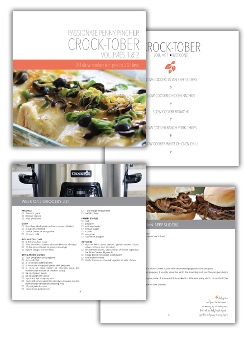
You’ll love this cookbook!
Looking for a great cookbook to add to your collection? This one fits the bill with its great design and “done for you” grocery lists, you’ll love how easy it and the recipes are delicious!

40+ Slow Cooker Recipes + Grocery Lists + Menu Plans all in one place! All designed by Beyer by Design!
Be sure to grab your copy HERE.
by Cheryl | Saturday, May 23, 2015
Oh to start so small and insignificant … then become so large and powerful! Look at the hues, the shapes, the sizes, the masterful way they float up into the air. They scream, “LOOK AT ME!” We watch, we wait, we stand in awe of the colors soaring … soaring … soaring into the sky. The large and powerful … become small again, but not insignificant, small and oh so powerful, so beautiful. We could watch all day and revel in the significance.

… to be seen

… to wonder
… to fly

… to arrive
